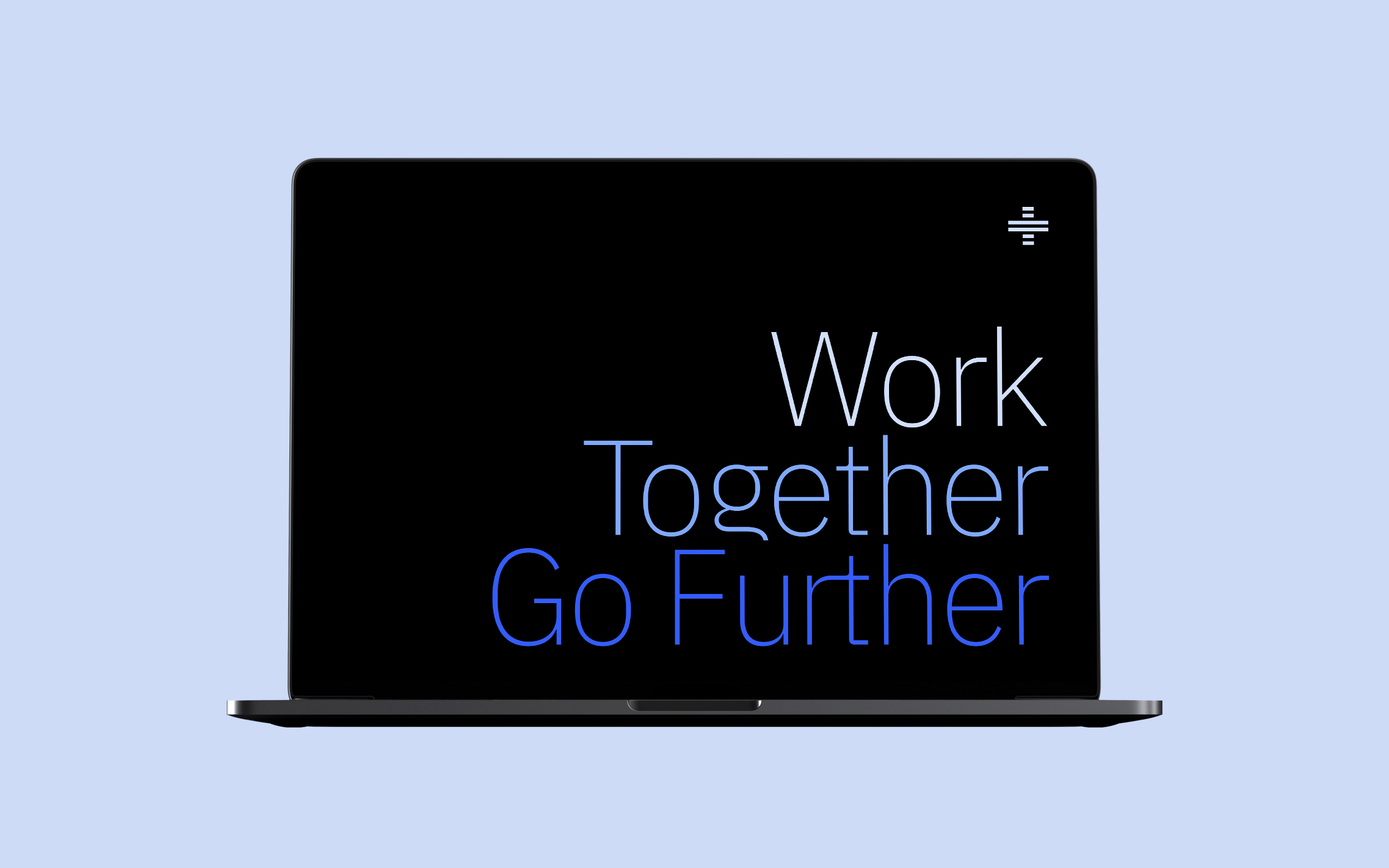
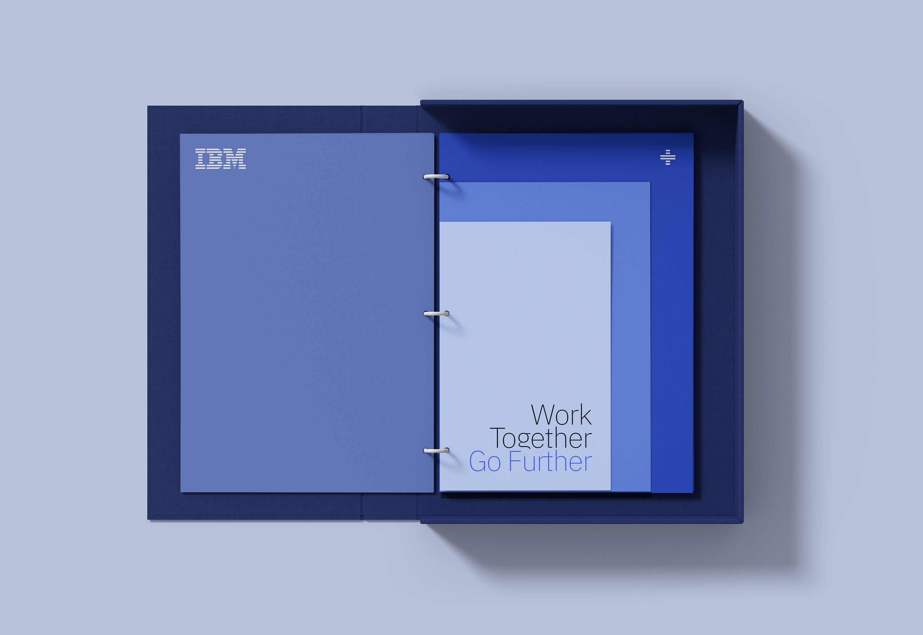
Brand identity and visual assets for IBM Partner Plus program.
IBM PP visual universe was based on the power of a collaborative system.
A program conceived to create strong alliances between companies.
To grow in tandem. To build by partnership.
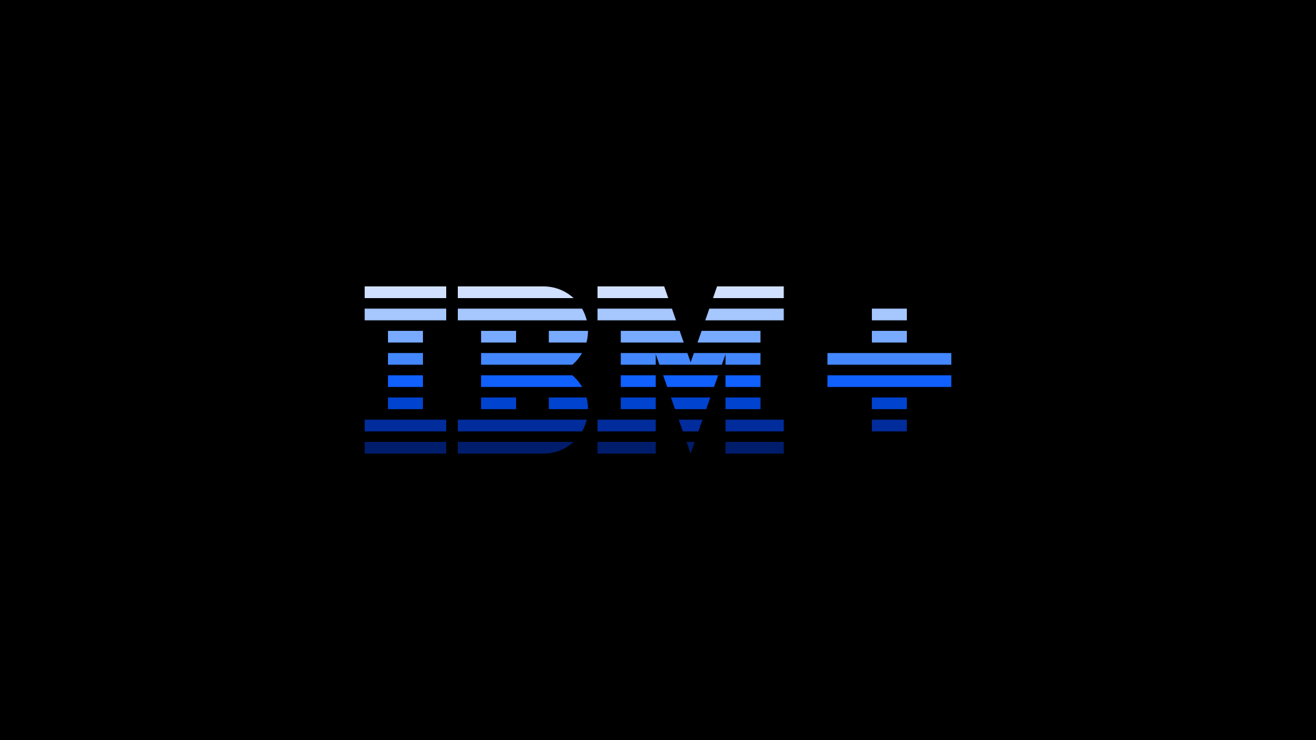
Coming from the original 8-bar IBM logo we created
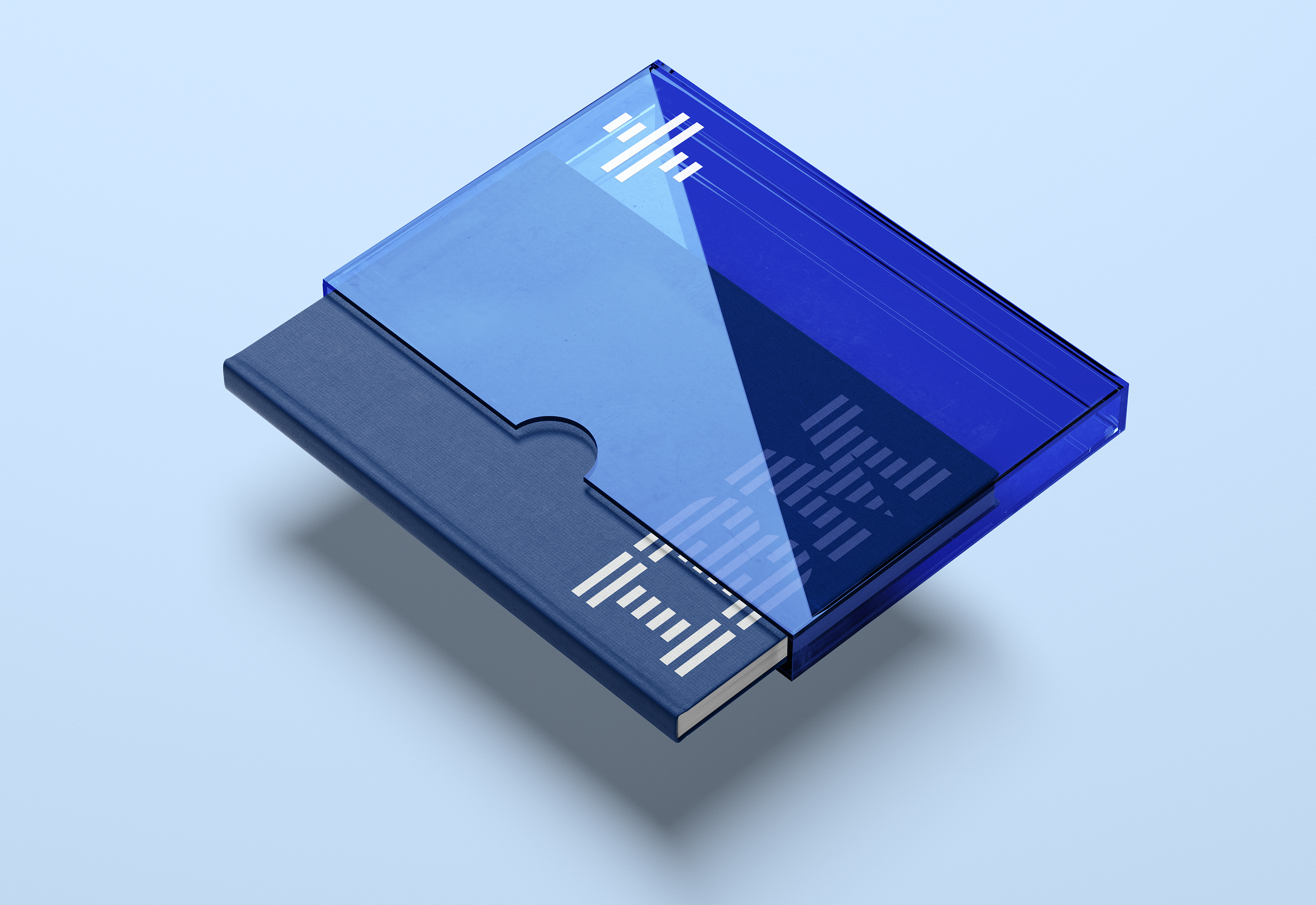
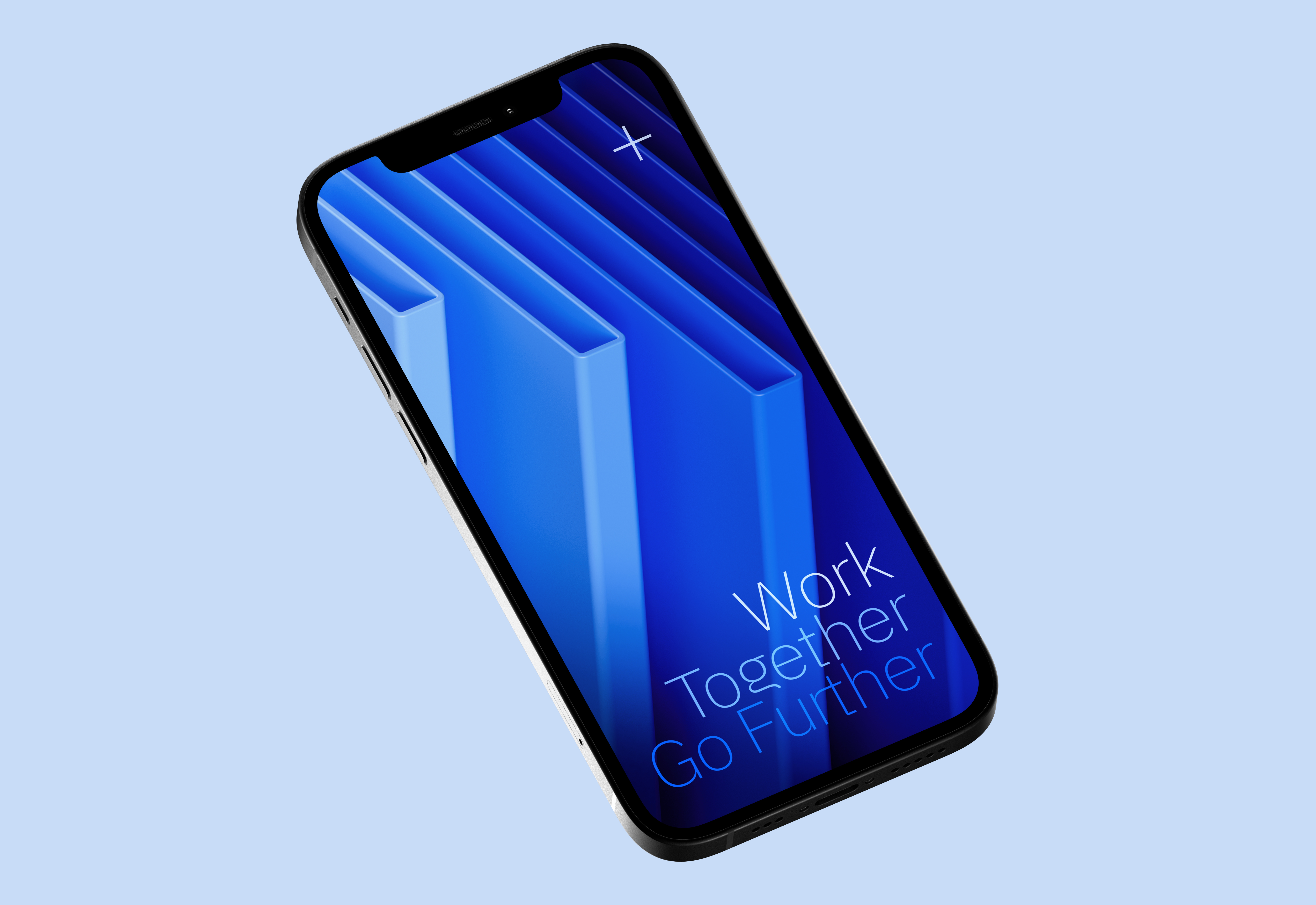
a 6-bar plus symbol that allows us to sign any application on its 2D version. Due to the need of having a more conceptual type of content, we also built a tridimensional universe featuring the new plus symbol that elevates the communication to a whole new ground for this product category.
Our six tones of blue derived from IBM’s color palette and they are used in a gradual and systematic way to reinforce the notion of constant growth.
Typography, layout and graphic elements follow this principle.
Go far, go together.
Categories: Branding, Art Direction, Digital.
Role: Creative, Design, Art Direction, 3D.
Year: 2022
Agency: Buck
Client: IBM
Role: Creative, Design, Art Direction, 3D.
Year: 2022
Agency: Buck
Client: IBM
